

Statistical Tricks in Climate Change
Man-made climate-change alarmists are having a field day with the summer heat we just endured.
The truth is that no catastrophic warming is imperiling the planet, despite headlines such as this one from AccuWeather: “The world has just experienced the hottest summer on record by a significant margin.”
The Washington Post parroted that proclamation with, “This was the world’s hottest summer on record ‘by a large margin.'”
And let’s not forget that bastion of journalistic excellence, NPR, which also announced: “This summer was the hottest on record across the Northern Hemisphere, the U.N. says.” United Nations Secretary-General Antonio Guterres warned in his typically inflammatory way: “The dog days of summer are not just barking, they are biting. Climate breakdown has begun.”
Has it indeed? The U.S. National Oceanic and Atmospheric Administration (NOAA) must have missed the memo, because just this week it announced that the “U.S. saw its 9th-warmest August on record.” And an even deeper dive into the actual data behind this headline reveals that this entire summer was cooler than nine others.
Admittedly, NOAA’s data go back only to 2005, when the agency began using its current measuring technology. The year 2012 was by far the hottest in that range. But these anomalies, measured in degrees Fahrenheit, are well within natural variation, as we’ll see.
In the meantime, we owe a hat-tip to Larry Hamlin, who posted these data at the climate news website WattsUpWithThat.com, asking the logical question, “Where is the Climate Emergency?”
From that site you can also access EverythingClimate.com, which gives a more comprehensive and accurate report of global temperature trends. It starts with this graph from the U.S. National Aeronautics and Space Administration’s Goddard Institute for Space Studies.
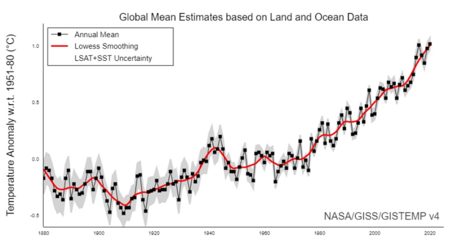
Everything Climate says it is the “most cited and referenced graph of its kind in the world, depicting a sharp rise in global temperature over the 140 years from 1880 to 2020. It shows that we are in a runaway warming trend that constitutes a ‘climate emergency.'”
Hence all the doomsday, Chicken Little headlines about catastrophic global warming.
But there is something interesting about the y-axis of that graph. As Everything Climate explains:
The entire graph … is displaying just the small change of 1.1-degree Celsius, which is highly magnified to show the trend. Because this small temperature change is magnified, it gives the false impression of having a steep rising slope. For the unobservant, that steep slope looks like a dangerous trend that would constitute a “climate emergency.”
Here is the same data plotted with a similarly narrow range of 3.5 degrees Fahrenheit. The graph shows temperature anomalies from 1880 until 2020.
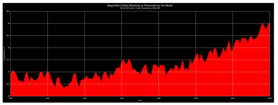
But the good folks at Everything Climate took NASA’s raw data and made a new and improved graph, seen here:

The y-axis shows Fahrenheit temperatures on a scale of normal human experience — from frigid winter to the dog days of summer — or specifically, zero all the way up to 120 degrees. If you look closely you can detect a slow, gradual rise in actual, absolute temperature over the last 140 years.
Viewing the two graphs together, it is easy to see how you’ve been deceived. They display identical results with only changes to the y-axis. Yet one screams “Climate emergency!” while the other says, “Nothing much to see here.”
You may be thinking that the x-axis deserves a little attention, too. What happened prior to 1880?
Historical record proves that between roughly 1300 and 1850 the world experienced a “Little Ice Age” during which the River Thames would freeze hard and thick enough for Londoners to stage “Frost Fairs” on its icy surface.
Prior to that, from about the year 900 until 1300 A.D., the prosperous Medieval Warm Period witnessed global temperatures considerably higher than those of the present day.
Greenland was fertile enough to produce impressive crops, and Vikings took advantage of the opportunity to settle there and strike up trade with Europe in agriculture, fishing, and the ivory market. They thrived until the Little Ice Age chased them away.
A recent study published by Elsevier confirms what many similar investigations have concluded in the past. Average global temperatures during the Medieval Warm Period were as much as 2.81 degrees Celsius higher than they are today.
It’s an interesting number to keep in mind as our government officials are careening the country toward a so-called “net zero” future where we will supposedly own nothing and be happy.