If you think what you’ve seen of ObamaCare thus far is bad, think again. You ain’t seen nothin’ yet.
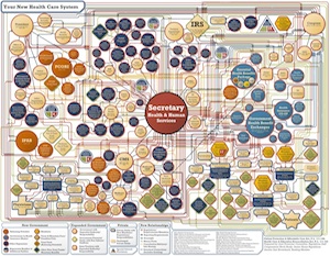
The Republicans of the congressional Joint Economic Committee, led by Sen. Sam Brownback of Kansas and Rep. Kevin Brady of Texas, have assembled a diagram to show just how all the new mandates, taxes, bureaucracies, and other expansions of government power fit together. The result, which “portrays only about one-third of the complexity of the final bill,” according to Brady, is a frightening and impossibly complicated network of rules and regulations that separates patients from doctors and separates both from the actual cost of healthcare.
Brace yourself. Here is the chart:

Even a high-priced Washington attorney with a GPS couldn’t navigate that mess.
Notice how vast the gulf between physicians and patients is and how many other entities come between them.
Notice, too, how one person, the Secretary of Health and Human Services, seems to be in complete command of the entire healthcare system — as sure a recipe for disaster in the United States as such command-and-control structures were in the former Soviet Union.
Even worse, working very closely with the Secretary is the Centers for Medicare and Medicaid Services, headed by none other than the recess-appointed Dr. Donald Berwick. Berwick, as The New American has reported, is enamored of the British National Health Service, believes that a “just, equitable, civilized, and humane” healthcare system “must redistribute wealth,” and openly favors government rationing of care. Is this the guy you want working hand-in-hand with the person in charge of the whole healthcare system?
Take note of the large number of orange entities; these represent mandates, programs, and agencies with the potential to result in rationing of care. Note, too, how many are closely tied to Berwick’s home turf at CMS.
Hexagons represent brand new mandates. This writer counts five of those, but within one (insurance mandate) is contained 17 different mandates. Thus there are actually 21 new mandates represented in the chart, which, again, only shows about a third of the actual ObamaCare system. Imagine how many more mandates may exist in the entire system.
Anything outlined in red or green, plus the circles representing bundles of additional entities, means new or expanded government. Those, of course, cover most of the chart.
Blue-outlined entities are private entities with new mandates, regulations, or responsibilities, which account for all private entities on the chart save one: self-insured health plans. How those escaped Congress’ notice is one of the great mysteries of our time.
There are also 19 special-interest provisions, accounted for by the blue triangle in the upper right-hand corner.
Then there is everyone’s favorite government agency, the Internal Revenue Service, which is charged with enforcing the mandates — as if income-tax season weren’t already stressful enough for most Americans.
The chart also portrays $569 billion in higher taxes, $529 billion in Medicare cuts, 16 million more Americans on Medicaid, and “two new bureaucracies with powers to impose future rationing: the Patient-Centered Outcomes Research Institute and the Independent Payments Advisory Board,” says the committee’s web page.
The GOP may have drawn up the chart purely for partisan political gain, but it is still a worthwhile service. Perhaps Republicans have even learned a thing or two about the dangers of supposedly well-intentioned legislation from this experience.
The last word on the chart goes to Brady: “For Americans, as well as Congressional Democrats who didn’t bother to read the bill, this first look at the final health care law confirms what many fear, that reform morphed into a monstrosity of new bureaucracies, mandates, taxes and rationing that will drive up health care costs, hurt seniors and force our most intimate health care choices into the hands of Washington bureaucrats. If this is what passes for health care reform in America, then God help us all.”


